Titles
We looked into many horror films, in order to
Mirror Mirror
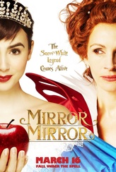
We decided early on that we would be basing our OTS on mirrors so our first idea for a name would be about mirrors. However this title hints at Snow White which is not scary and also even has a film in its name about snow white and so it did not have the desired effect.
-LR
-LR
There Was No Light
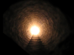
Our next choice for our title came from the idea that when you die you see a light at the end of the tunnel which takes you away to the afterlife (heaven or Hell) but as we are having our antagonist being a spirit, we thought it would be appropriate to say there was no light and so the spirit is trapped. However we found that when asked people didn't really understand it so we had to pick again.
-LR
-LR
Shattered Glass
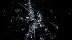
The Title did stick for a while but we found that again it didn't have the desired effect we were looking for. The title has hints of danger as glass can be sharp and hurt you. However our OTS is about mirrors and spirits and didn't fit the plot, as the idea was a crime with no evidence, and a shattered mirror would show some proof of foul play.
-LR
-LR
Amara
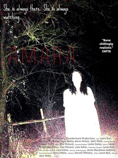
We have chosen to use the name Amara because we found its quite common for a horror film to be named after its main antagonist and that the names are often a little creepy. This idea of a name for a title requires little explanation and works effectively. Amara is the spirit trapping people in mirrors. We also chooses the name Amara because of it's meaning. Amara means darkness and we found that to be fitting as she kills people, thus putting them in eternal darkness. The name Amara also sounds old, and we wanted to show the idea of her being out of her time period, thus giving the idea that the protagonists in the story are not the first to be terrorised.
-LR CD
-LR CD
Title Font Research
|
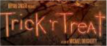
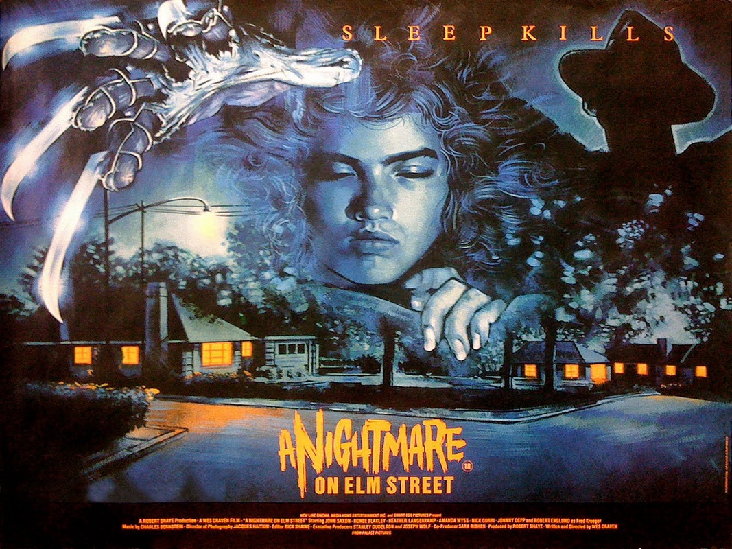
By doing research on horror titles I have concluded that most horror films use a very jagged text. This rough font looks the title look engraved and imperfect as if someone has quickly wrote it. This gives the audience a quick feeling of fear and creates an unsettling feel. This clearly distinguishes the film as horror. Other genres might use a more block-like text where as horror tends to go for a text that looks like someones roughly scribbled it down. A modern example would be the film "trick 'r' treat". The 2007 film directed by Michael Dougherty uses a very slim and tall font making it very easy to read. It also has an orange glow to it so it stands out against the gloomy background. This use of colour is effective because the background picture is very dark and gloomy. An older example would be Wes Craven's "A Nightmare on Elm Street" (1984). This also uses a jagged text. In particular the word "nightmare" is in a very jagged font. The word nightmare is the sense of danger in the title and therefore by making the text a different style it makes the word stand out more compared to the rest of the title.
KD |
|
Font Analysis
We have used the font that we have on the website because it is very spidery and has scary connotations. It looks very creepily handwritten Which makes it look scarier. It suited our horror film a lot more than other fonts like Arial or Comic sans as they do not look serious or creepy enough to be on the website of a horror film.
The font on the OTS is a red bold font to make it stand out and the red has horror connotations. We have decided to put them in the corners or botto of the screen o that it does not take
-LE
