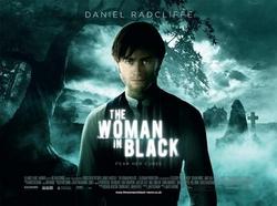
The Woman in Black uses the image of the main character. They used this image as Daniel Radcliffe is well known and that can be used to draw more of an audience. the film focuses on the death of children, which can explain the use of white in the title. The cover also portrays the protagonist as being slightly dark, and in the film he is portrayed as the cause of the children's deaths due to his interference. The lack of colour could also represent the time period in which the film is set.
-LR
-LR
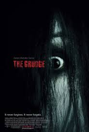
The grudge uses a very simple cover for their film, this is to avoid confusion or having too much happening. They have a photo of an extreme close up of the main antagonist (The Grudge) The close up shows fear in the faec of The Grudge but it also shows phsycoligiacal problems which shows that there will be a good background behind this character. The Background to the cover is just black which has dark, evil, mysterious connotations, The audience can tell just by looking at this cover that is is for a horror film. The Title is in red which has connotations of blood and danger, this is showing the audience that this film will not be boring that it will be exciting with danger, the blood also has connotations of blood so the audience know that death will take part in this film. The slogan for the film is down in the left hand side corner and it says "it never forgives, it never forgets" This is showing the audience that the antagonist of this film has truly evil intentions. The bold font is showing that the grudge is ruthless and a strong antagonist. -LE
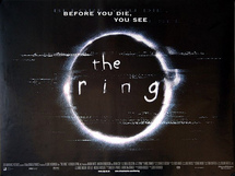
The Ring uses a image of as ring, but looking distorted. This fits in with the key plot of the film it revolves around a movie and the distortions look similar to those you would see it an old tv. The name of the movie is the ring and the circle is a representation of this. However it could be called abstract as the ring is actually referring to the telephone ringing, not an actual ring. The backdrop is black, which has connotations with death and mystery, and then the ring is white which usually portrays innocence. The font is childish which also reinforces this idea of innocence, yet also gives the idea of being told what to do and things being out of your control, as they are when you are a child. The cover also includes a couple of words to sort of sum up the movie. These words are smaller and in a more common font, leading you to believe that they are not as important as the rest. Finally at the bottom of the cover you have a list of the opening titles, in a darker text so as to not draw attention to them.
LR
LR
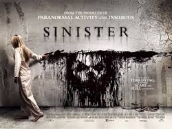
Sinister has a cover showing key characters from the film however it has been done in a way that is not in your face. The ink manipulation which forms the face of the key antagonist (the boogeyman) is black, showing that the face must be evil due to the colour connotations. The fact that a child is the one dragging the ink portrays that maybe the children are not innocent in this film. The use of the child group suggests how even the most innocent in this world can be changed and be used as a weapon.
The child looks to be in her early teens, which is an age group when kids start to rebel or act out. This changes the earlier connotations, to the idea that teens, who have more stubborn ideas and are on the brink of adulthood can be manipulated away from their families and towards the darkness that is usually thought to be from childhood. The font used for the main title is the most commonly used font in horror and is a type of variation on the font Times New Roman. The colour of the black on the white is suggesting a loss of innocence/childhood. The white wall, contains cracks, and that can be suggestive of the kids already having a darkness which the antagonist is taking advantage of
- LR
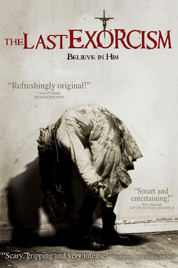
The last exorcism uses a picture of a victim clearly being possesed by a paranormal being, the victim has blood stained clothing but the blood has had the colour taken out to show that the blood is not what the audience is to focus on its the exorcism of the victim, The victim is wearing a white dress and the background is also white, this is showing that the victim was innocent and the darkness of the blood is showing that the innocene has been taken away from the child. The font of Times new Roman is showing is very commonly used in horror but the variation in The Last Exorcism has smudges of blood coming off the title this is showing that death will occur in this film. A lot of horror films use Red text for the title as it has the connotations of blood and death which is what and audience want to know they are going to get from a horror film. The cover uses quotes from newspapers that have seen the film this is going to make the film appeal more to the audience as it is promising that the film will be enjoyable to watch. The use of the Crucifix in the background is highlighting that this film has a religious background.- LE
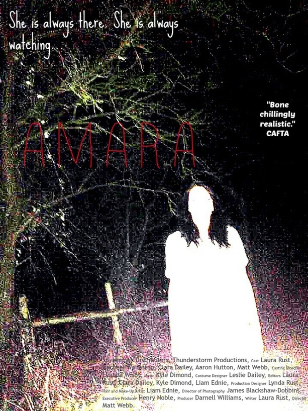
After looking at several covers we decided on all the things we liked for our own. to start we whited out the figure on the screen in order to make her appearance in the film more effective as you dont know what to expect. Next we pixelated the entire thing as with our spirit, she has a thing for messing with technology and technology is made by pixels. we adopted the usual colour of grey for the titles at the bottom, which is common in covers, as they both blend in and stand out. At the top we put a tagline for our film which is both relevant and also quite generic, as we didn't want to give too much about our film away. We set our cover outside to show that our spirit is not limited to any area, and so adds the aspect of unpredictability of what is going to occur in our film. We picked different fonts, in order to draw the audiences attention to different parts of the cover. We also picked to only give the title a colour as it is the key bit of information on the screen. We picked the colour red due to its colour connotations, such as blood, danger and also anger (as we wanted our spirit to mess with its victims, thus making them angry). Finally we picked to have a quote from CAFTA, as they specialise in horror films. This makes people want to watch our film as they will trust that if these experts think its good, then so will they.
-LR, LE
-LR, LE
